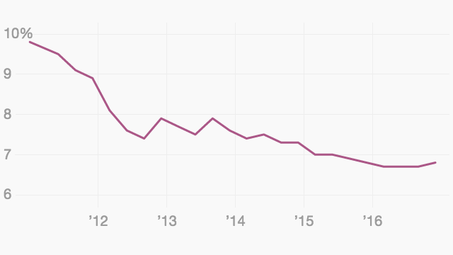
A contact referred us to this site for a chart showing international comparisons of mobile internet speeds – Australia (fifth) is not too shabby, much to our surprise – but we can imagine it being very useful in many fields where a historical take on a statistic needs to be presented graphically. Apart from internet speeds, we found charts on global wealth by region (sponsored by Credit Suisse), pharmaceutical company profits (Pfizer aces it), teacher salaries, Asia-Pacific salary rise comparisons, industrial robots, 3D printing, what Americans are afraid of, and so on and so on, and the graphs just keep coming. And you can download both the data and the image – Alan Kohler take note. There’s one below.
Atlas charts a very useful online resource for all sorts of historical information
Click here for all items related to: Strands of Australian history


